 Mariyam Meeran
 The all-white kitchen is quietly being retired. So is the cool gray sectional, the stark minimalism that dominated the last decade of interiors, the sense that a home had to look like a hotel lobby to feel expensive. What’s replacing it is warmer, rougher around the edges, and considerably more interesting: a palette and philosophy built on depth rather than restraint.
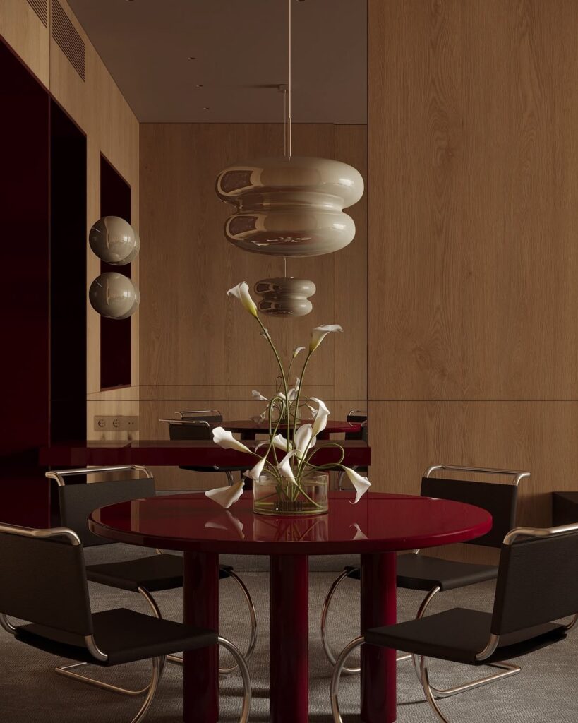
Color is where the shift shows up first. Burgundy, ochre, terracotta, and rust have moved from accent to architecture, showing up on cabinetry, accent walls, and even full color-drenched rooms rather than staying confined to a single throw pillow. Designers describe the appeal in almost sensory terms: these are tones that absorb light rather than reflect it, creating a sense of envelopment instead of glare. Burgundy in particular has shed its dated, “grandmother’s dining room” reputation and returned as something closer to sophisticated depth, often layered with warm metals, dark wood, and deep jewel accents like emerald or petrol blue. The throughline is warmth as a structural quality, embedded in the pigment itself, not applied on top of a neutral base as an afterthought.
That warmth doesn’t stand alone, though. The most compelling rooms right now pair it deliberately against something cooler and quieter: a dusty blue, a sage green, a cold stone counter, a brushed steel fixture, so the burgundy or ochre reads as rich rather than heavy. It’s the same logic chefs use with sweet and acid: warmth needs a countertone to keep it from tipping into excess.
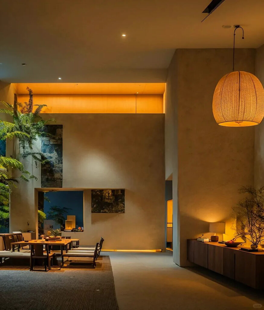
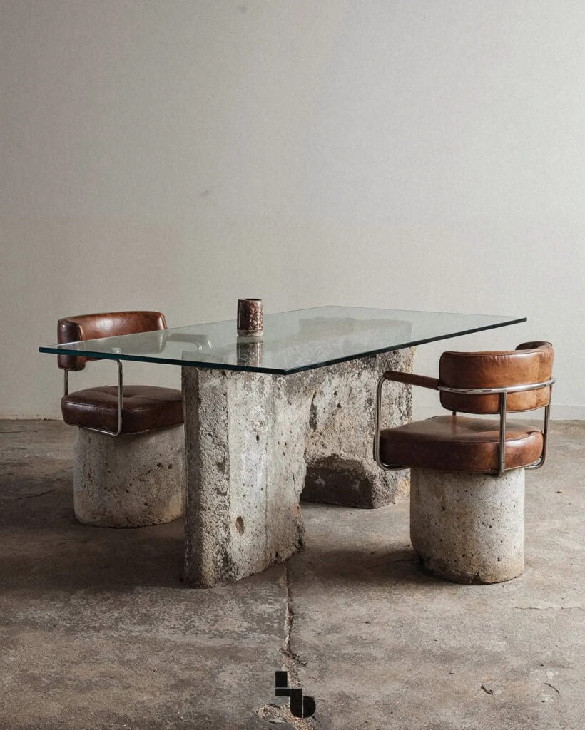
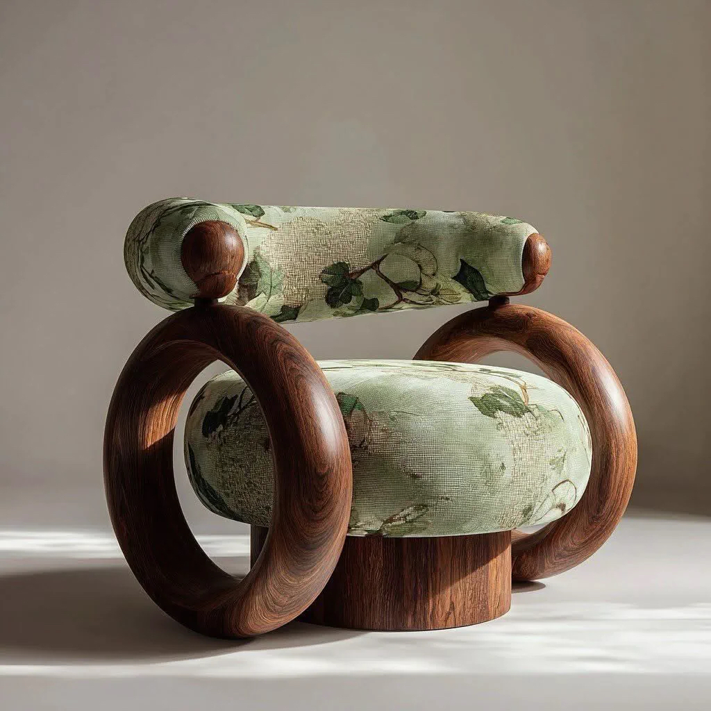
Material tells the rest of the story. Raw and visibly imperfect surfaces, unlacquered wood grain, natural stone with visible veining, lime-washed or textured plaster, are being chosen specifically because they show their own history. This is a deliberate rejection of the flawless, mass-produced finish that defined the last era of interiors, in favor of surfaces that look touched by hand because they were. Handcrafted furniture fits the same instinct: pieces with visible joinery, hand-carved detail, or artisanal ceramic work are prized precisely because they can’t be perfectly replicated, which is exactly the point. A slightly uneven glaze or an asymmetrical edge now reads as quality, not flaw, proof that a human being, not a factory line, made the decision.
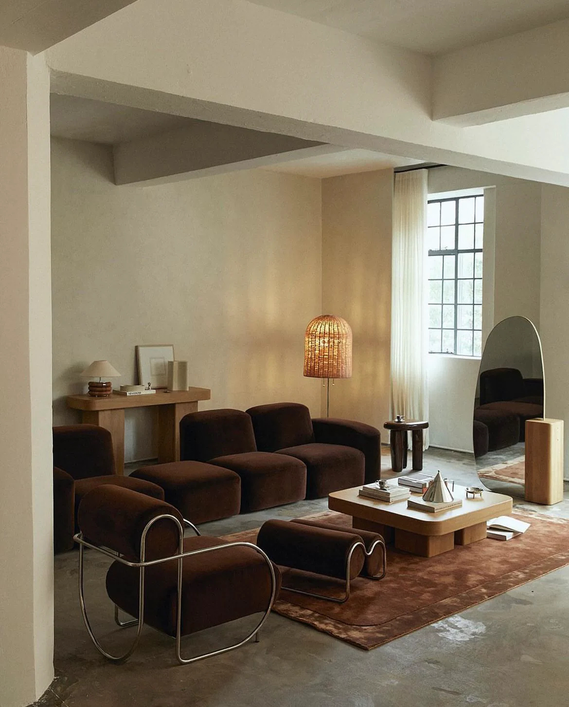
Lighting has adjusted to match. Cool, even, shadowless light, the kind that once signaled a “clean” modern home, is giving way to warmer, layered sources: dimmable amber-toned bulbs, low pools of light from table and floor lamps rather than a single central fixture, candlelight treated as a design element rather than an afterthought. The goal isn’t brightness. It’s atmosphere, a room that looks different, and feels different, at 9pm than it does at noon.
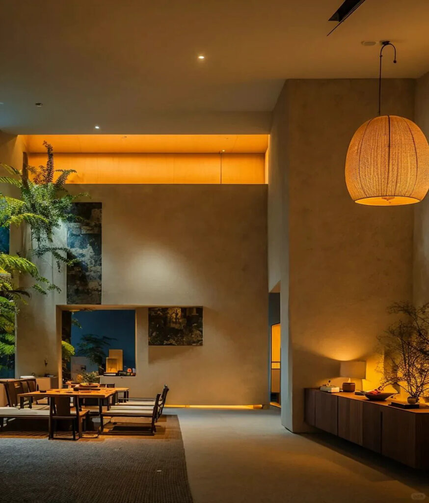
Taken together, these aren’t separate trends so much as one instinct expressed several ways: a pushback against the sterile, camera-ready interiors of the past decade, in favor of spaces that feel inhabited, textured, and a little bit imperfect, on purpose.