
Miscellaneous
The Perfect Stroke
By Hend Seif El Din
The Big Picture
 When it comes to the style and subject of the painting, you need to look at the bigger picture. Think in terms of the general feel and function of the room as well. Most likely a kitchen-related painting will not fit into your living room; surely you get the picture. If the latter doesn’t work, ask yourself “does the room have a theme”? If the answer is “yes,” then stick to that theme, to avoid looking messy.
Sizes and Shapes Galore
I can assure you that almost every–and any–size and shape you can think of in terms of artwork, is available on the market. From rectangles to ovals and everything in between, your only problem will be deciding on which shape and size to go for. From personal experience, I would say opt for rectangles and/or squares; they fill up spaces nice and give walls a more “organized” feel.
As for the size, again, I would say bigger is better; but not too big! How will you know whether the artwork is just the right size? That’s easy! You need to make sure that there’s enough of a “wall-frame” around the entire painting. Do not let the edges of the canvas “get stuck” to the walls. Bear in mind, though, that if you do go for a large canvas, do not clutter around it; give it its space, and it will fill it up beautifully.
The Full Spectrum
Color is tricky. Sometimes just a shade lighter or darker than the background surface can look kitschy. So, think in terms of complementary or contrasting colors; if you choose your artwork based on one of the two (or both!) concepts, you shouldn’t be faced with any mismatch-related problems.
If you do not really “want” colors, go for a sepia or monochrome painting or print; contrary to popular belief, they are not boring at all! They can actually create either a calming–or a very dramatic–effect, depending on the content and the backdrop they’re up against.
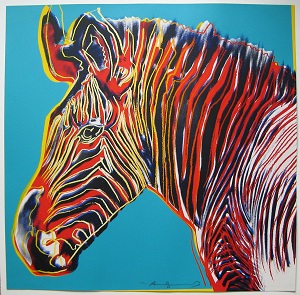
Feel free to think in terms of art movements as well, most of them follow certain color schemes and/or effects. For a bright, dramatic effect, opt for work by pop artists–like Andy Warhol, for example–Fauvists, and/or Expressionists. Looking for a classic-styled painting, consider works by Realists and Impressionists. For a more modern look, opt for Cubist or Abstract Expressionist works.
Frame, Glass, or None?
This could get a little bit tricky. Some people have the tendency to frame everything, while others believe a canvas looks its best naked; there is no right or wrong answer here, it highly depends on the work itself as well as the general design of the space.
If you’re choosing artwork for a classically designed room, frames do work well. Do not feel obliged to choose frames that are over-ornamented, because they often take away from the art itself. If your living room has an upbeat feel and you happened to choose a Warhol or Rauschenberg print, framing is not necessary.
As for glass, it should be considered with respect to artworks that are not cleanable, i.e. art that includes watercolors, pastels, and/or charcoal, which could collect dust very quickly. Acrylics and oils do not need to be shielded with glass, but it is necessary to make sure they’ve been varnished. The varnish protects the surface from dirt and dust, keeps the colors luminous, and makes it easy to wipe it clean if necessary.


0 comments