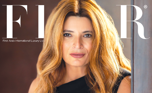

Interviews
Sir Paul Smith
“Britishness” at its Best
This British fashion designer truly needs no introduction. As one of the leading designers in the wonderful world of fashion, Sir Paul Smith is inventive, creative, and inquisitive. His free mind and excellent observation skills ensured his rise to stardom…and lucky for us, kept him there! In this FLAIR exclusive, he talks to us about his latest collections, inspiration, colors, patterns, and everything in between.
What inspires you? Where do you draw your inspiration from?
Of course, after many years of designing I am totally immersed in my job. Generally a lot of my inspiration for new collections comes from changing the previous collections ideas only very slightly so that the collections follow on from each other. This is especially relevant within my men’s collections as things don’t change so radically from season to season, as they do for women.
Luckily, my ideas flow quite easily through having a curious mind and good observation skills!
![]()
How do you manage to remain at the forefront after more than 40 years in the fashion design industry?
I hope it is because I have a very childlike mind, not childish, but childlike! This means I am inquisitive and have a free mind, not cluttered with experience and too much information. I am also lucky to have good health and lots of energy, which definitely helps!
What about your interests, other than fashion designing of course.
I have always been interested in all aspects of the creative industries; architecture, art, graphic design, photography. My weekends are often spent in museums or art galleries. I am an avid photographer and I shoot all my advertising campaigns and often work on projects for magazines.
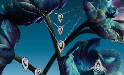
Tell me about your Fall/Winter 2013 Women’s collection; I noticed you’ve used a lot of contrasting textures, colors, and silhouettes.
I really tried to push myself with the main catwalk collection (as I am sure you know I have 3 women’s collections, as well as accessories shoes and bags) which has some masculine elements which is a common theme in my work. Based on my many years as a designer for men I wanted to work with color but in a way that gives the wearer the opportunity to put colors together in a way she wanted and perhaps had not done before.
The fabrics used are very luxurious with many different textures and yarns.
![]()
What are some of the materials that are unique to this collection?
We used printed jacquard silks with a photograph that I had taken on a visit to Cuba of a grand house interior and printed chiffons, to name just a few.
What would you say inspired your Fall/Winter collection?
As I said before some elements are inspired from my clothes for men, but the more feminine pieces come from the fact that we were work a lot with actresses and musicians and so, there is a more feminine sexy element mixed with the boyish, androgynous look.
![]()
Tell me more about the “Point” fabric, which I know you designed.
As I am sure you know the point fabric is designed for upholstery for American company Maharam. However, the fabric is so popular we have used it not only for upholstery in our shops but also for shoes and bags. The point design was inspired by the Scottish Fair Isle knitwear and has proved to be enormously popular.
What about the men’s Fall/Winter 2013 collection. I noticed you used more traditional fabrics, yet managed to keep them looking fresh; how did you manage to do that?
We continued with color for the Winter 2013 men’s collection but in a more muted way, using very traditional fabrics such as flannel which has a very soft feel and is quite English. We also used various classic checks inspired by the famous Prince of Wales design. Lots of the fabrics are very luxurious and include alpaca, cashmere and soft wools. In addition, we had several printed fabrics, which are designed in our studio.
![]()
For both men and women, for you, which colors are the colors of the season?
For winter, for women, I like the mix of rust and hot pink. For men, I like jade and the wonderful knitwear that has colors that include, pink, red, yellow which are all very optimistic and happy.
For spring/summer the colors were more primary with reds and royal blues.
You designed the Giro d’Italia jersey, inspired by Andy Warhol…why would you say, did you use Warhol as your source of inspiration?
The Giro d’Italia jerseys always have to be the same colors- pink, red, blue and white and so, there is actually very little design input possible. With this in mind I decided to play with the contrast piping colors instead. With the pink jersey I mixed the traditional pink with red which is very typical of Warhol’s pop colour mixes.
![]()
What attracted you to the jersey-project in the first place?
My love of cycling started as a teenager and continues to this day. I love th sport and many of the well-known cyclists are friends of mine, including Victoria Pendleton, Mark Cavendish, Chris Hoy, Bradley Wiggins, David Millar As an avid follower of the Giro d’Italia and Tour de France, it was an absolute honour to have been asked to design the jerseys. .
Tell me more about the design.
As I said previously, there were a lot of restrictions when designing the jerseys, with the colour and basic shape already determined. However, I was able to play with the choice of fabrics and the especially the weight of the fabric which was important. I have added mesh side panels to give the wearer more movement and to enable the body to breathe. Often, racing jerseys have diagonal stripes going from the collar to the bottom of the sleeve, I find this makes the rider look like they have quite sloped shoulders so with this in mind, I kept the shoulder very simple, which I think achieves a more masculine shape.
You also designed the T-shirt to celebrate the release of David Bowie’s new album The Next Day. Why did you choose to work with Bowie?
Actually he chose to work with me! We are old friends and have been for many years. He contacted me and invited me to be the exclusive creator of the t-shirt which of course, was very flattering! Hopefully there will be more projects to come in the future!
What about the design of the T-shirt. How did you approach it?
The t-shirt is basic and the design follows the album cover artwork so we kept quite close to the brief.
![]()
I also read that you have several upcoming plans, possibly collaborations; could you fill me in on that?
There are always lots of exciting projects happening, however none that I can talk about!
By Hend Seif El Din


0 comments