Designed by Taylor Howes
By Hend Seif El Din
A guest lecturer at the KLC design school, as well as a supporter of budding entrepreneurs, Karen’s personal vision is what makes up most of the company’s DNA. She believes, that when it comes to interior design, a positive, approachable, and refreshing energy is key in producing great work creatively, and ensuring that clients enjoy the experience as a whole.
According to Karen, “the trick is designing a solution that is practical but also looks drop dead gorgeous.” Turning 21 this year, Taylor Howes mainly takes on private residences in London, including the largest private house in the city. Furthermore, the studio does not promote a signature style or look, instead, it focuses on providing clients with a home that is truly personal to them.
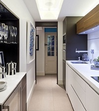
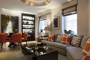 One of the studio’s latest projects is a two-bedroom apartment in Mayfair, London. Contemporary meets eclectic in this one-of-a-kind living space. The designer opted for neutral hues in beige with splashes of bold tones, dominated by oranges and yellows with turquoise accents. Laced with wooden finishes and luxuriously comfortable soft furnishings, the apartment epitomizes Karen’s vision and beliefs when it comes to interior designing. Opting for whites and blues with respect to the kitchen–very different from the rest of the rooms–Taylor Howes created a crisp and sophisticated space, with clean and sharp lines, magnifying the kitchen, yet keeping it cozy.
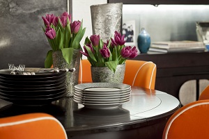
 Using a strong, bold shade of orange for the dining chairs, works beautifully with the light brown wooden finish of the floor, as well as the dark mahogany hue of the cozy dining table. To top it off, the designer opted for an abstract piece of art, graced with neutral hues to create an exquisite balance.
With neutral walls and fabrics, color is brought in through patterns and prints, creating an eclectic blend. With mostly indirect lighting, the living room oozes warmth and serenity.
 Note the exquisite matte gold table lamp. Laced with organic shapes and forms, its matching chapeau adds a dash of light to brighten up the space.Very different from most of the other spaces in the apartment, the kitchen is predominantly white, creating a sense of space. Mixing it up with splashes of blues adds just the right amount of color needed to shake it up a bit.
As for the bathroom, Taylor Howes chose a gray-brown marble with strong white veins, creating a modern, sleek, and perfect look. With stainless steel hardware, the overall ambience ensures a feeling of order and neatness.
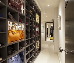
Definitely one of the most unique and innovative pieces in the apartment is this moneybag glass sculpture. With an ice-coated feel, it surely is one of a kind. As for the bag-and-shoes storage space, don’t you just love it? Organized, bright, tidy, and–in itself–a piece of art!
Once again, the design studio chose neutral hues for the master bedroom. Furthermore, the wall-sized mirror practically doubles its size! Nevertheless, splashes of color are apparent, through the use of throw pillows, laced with intricate details and bolder hues.
Opting for a deep, Monaco blue–with respect to the bedcover, wall treatments and throw pillows–set against a very neutral wall, once again proves that combining the bold and the less obvious, is definitely a winning move. To top it off, Taylor Howes opted for simple–yet elegant–artwork.

