‘What’s in a name?’ Shakespeare wondered in his classic Romeo & Juliet. For fashion brands the answer is everything! In recent years, a growing number of leading fashion brands have been making bold changes to their names, logos, and overall brand image. Whether due to freshly appointed fashion chiefs developing new creative vision or wanting to make a statement to the world, branding makeovers are taking place right and left. Here are five brands that dropped some fashion branding bombshells on us recently.
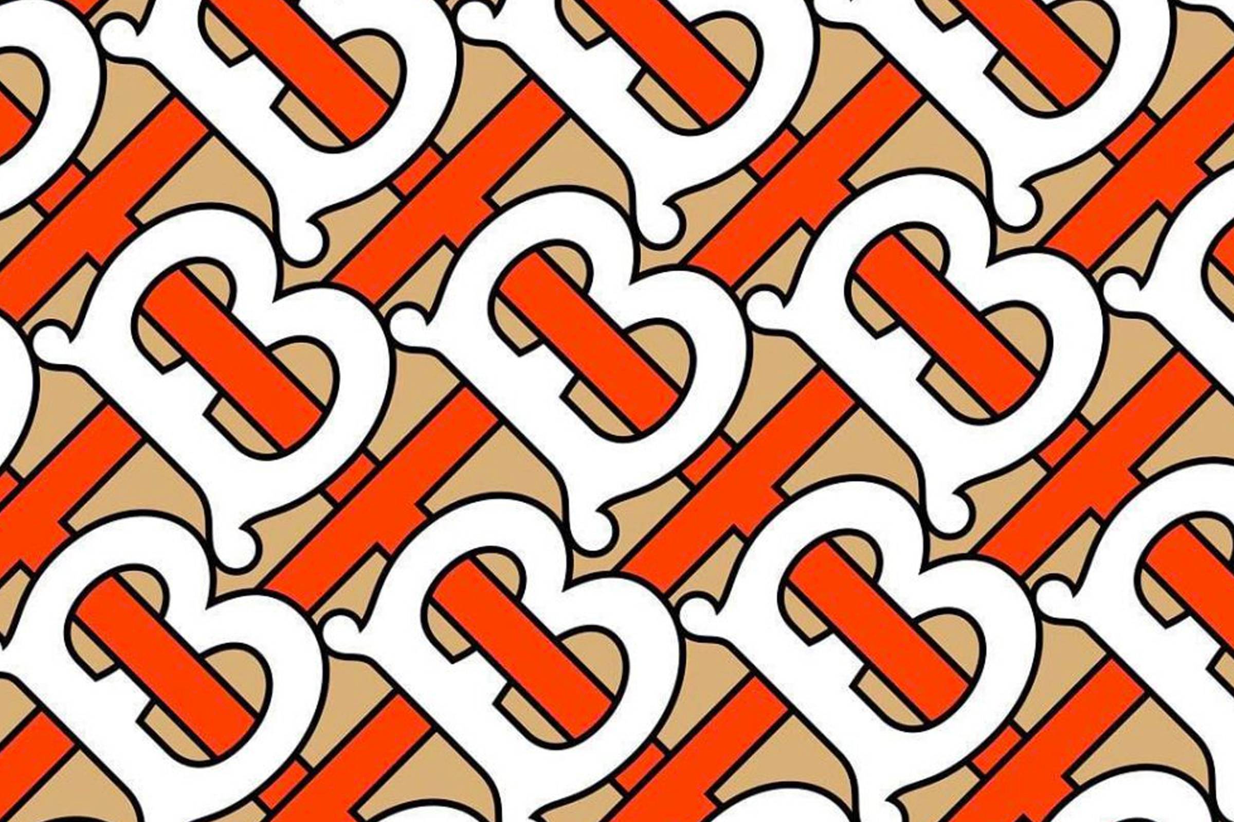
The 160-year-old renowned Burberry logo exited stage last August to make room for a new visual identity under the new reign of Riccardo Tisci. The Italian designer, who left Givenchy in 2017 and took over as Burberry’s creative director this year, produced a classic, contemporary logo and a monogram with the initials TB, in honor of Thomas Burberry, the original founder. About working with art director Peter Saville, Tisci said, “Peter is one of our generation’s greatest design geniuses. I’m so happy to have collaborated together to reimagine the new visual language for the house.”
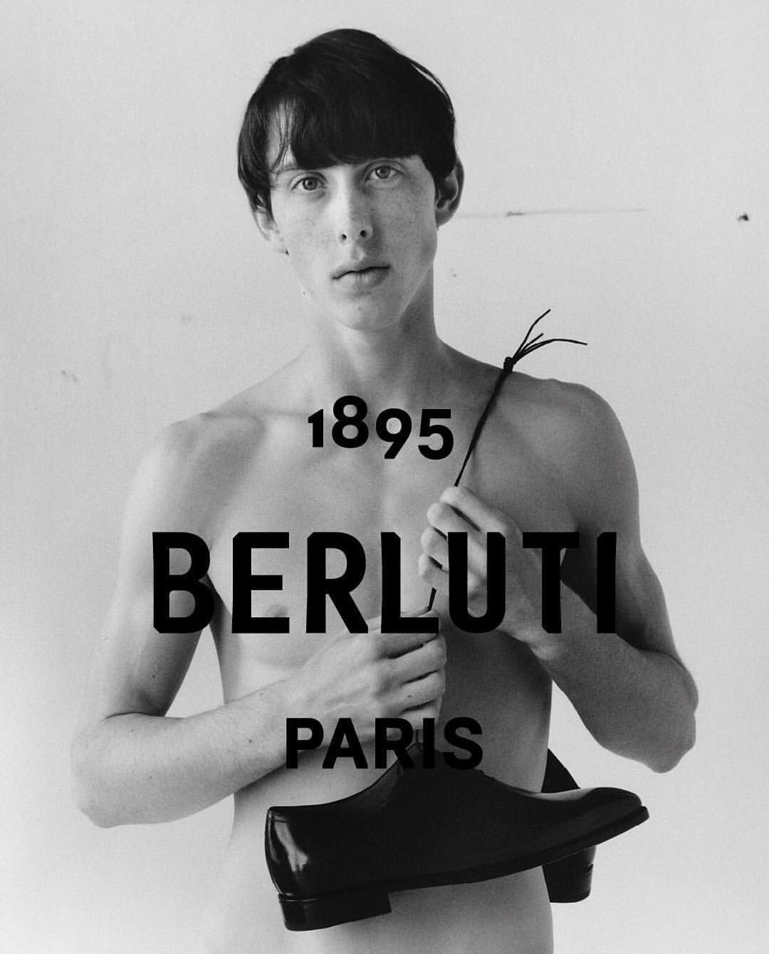
The unveiling of Berluti’s new brand image materialized in the first campaign ad since the appointment of Kris Van Assche as artistic director last April. The black and white photos shot by Jamie Hawkesworth and styled by Mauricio Nardi, along with the new logo, hinge on the very heritage of Berluti but also clue us in on the new direction of the fashion house. Created in collaboration with iconic graphic design studio M/M Paris, the logo highlights the brand name in the same way it was carved on a Berluti wooden shoe tree from 1895, the same year Alessandro Berluti became a shoemaker.
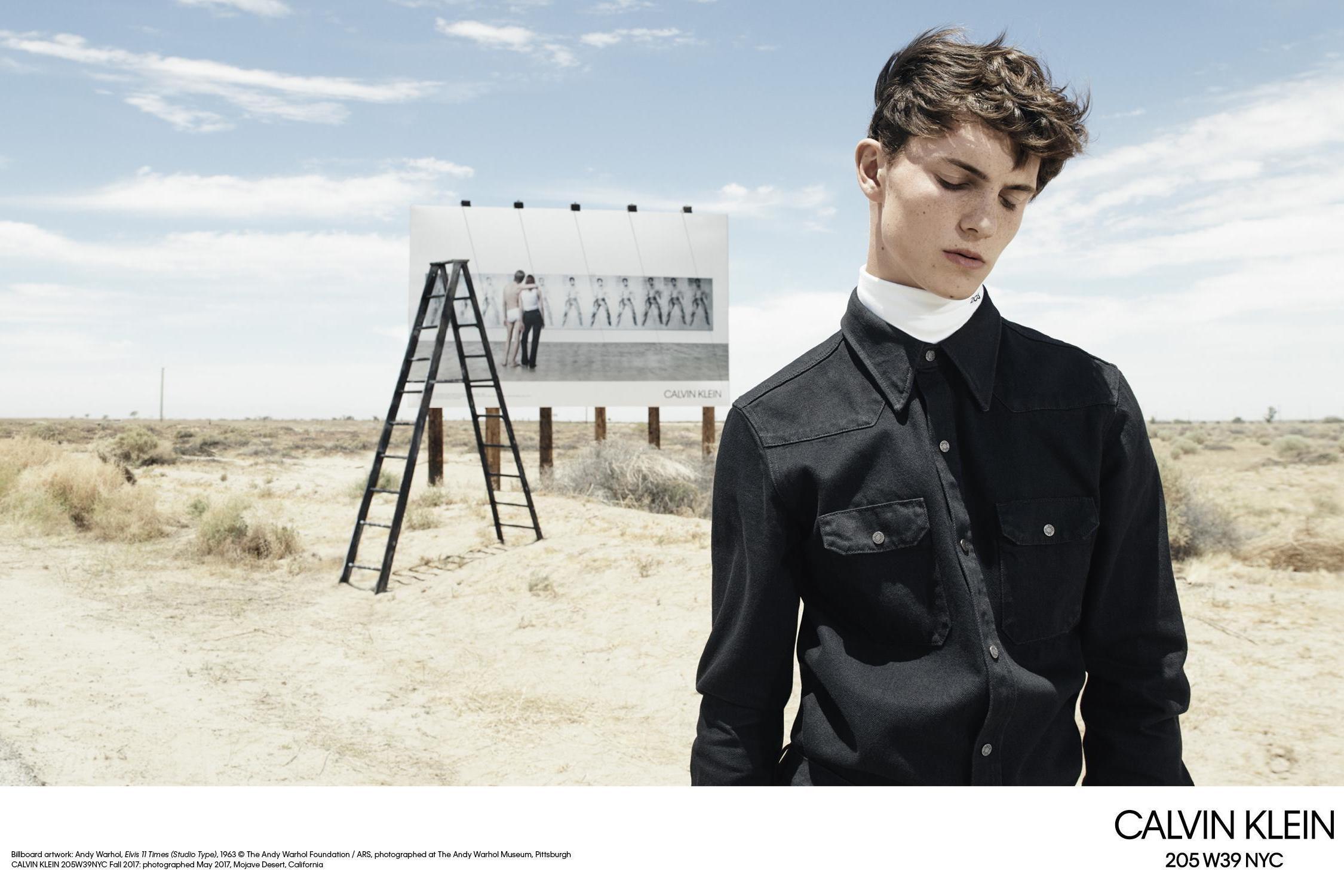
We’re actually guessing that Calvin Klein restarted this rebranding trend last year and then everyone agreed that it really was time for change and followed suit. Their logo debuted with the caption “a return to the spirit of the original” with the identical concept of acknowledging the founder and his original style. We’re just not sure how Raf Simons planned to accomplish that by turning the letters from lowercase to uppercase. The outcome is still impressive, though. Very vintage.
As for Celine, the change was subtle but nonetheless big. Hedi Slimane, former creative director for Yves Saint Laurent, killed the accent on the ‘E’ and altered the spacing between the letters as a bold statement to the fashion world that there is a new commander in town. The move was emphasized more when Slimane deleted the Celine Instagram account that symbolized the previous brand identity to re-launch it with the new logo, along with a new set of ad teasers.
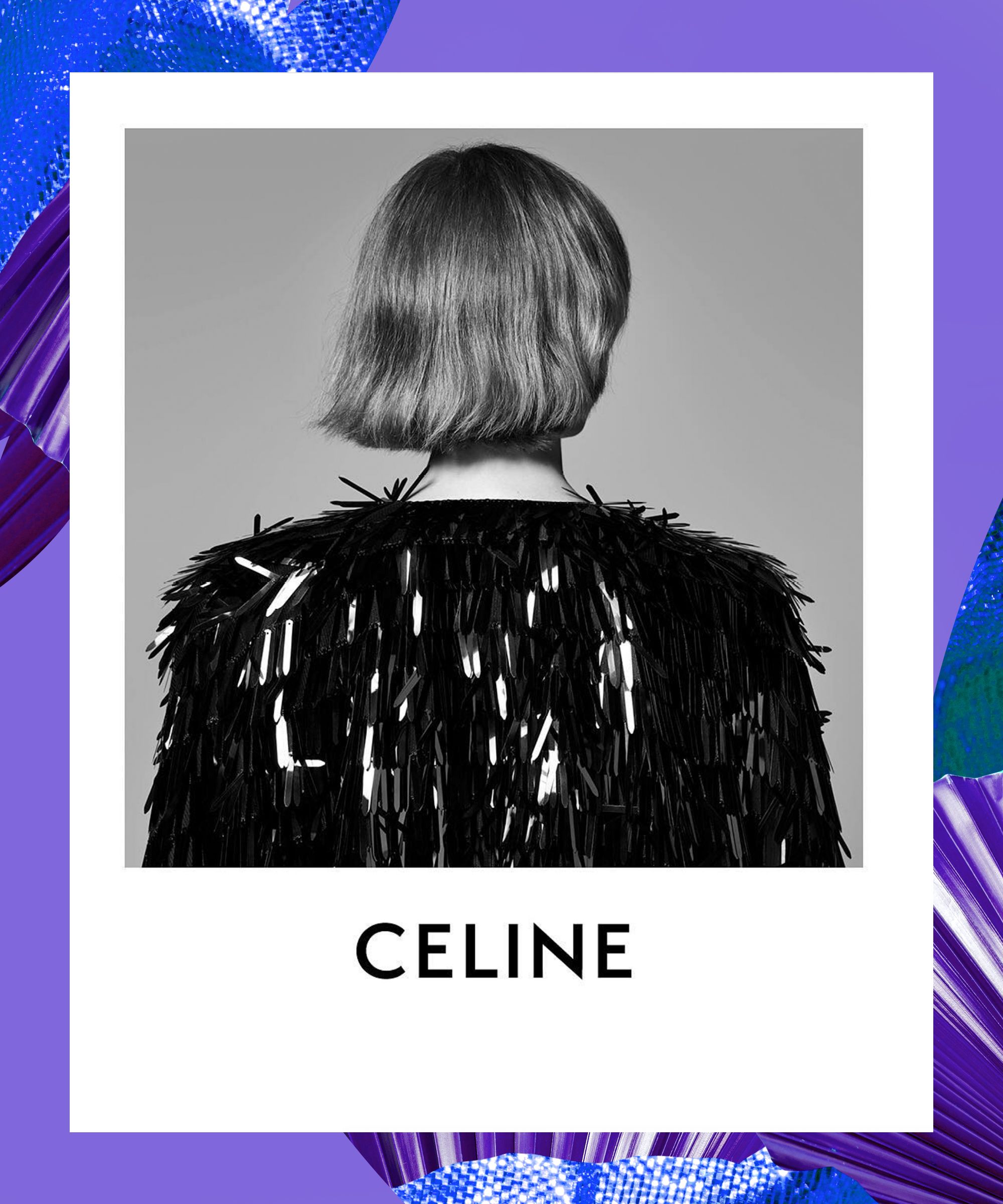

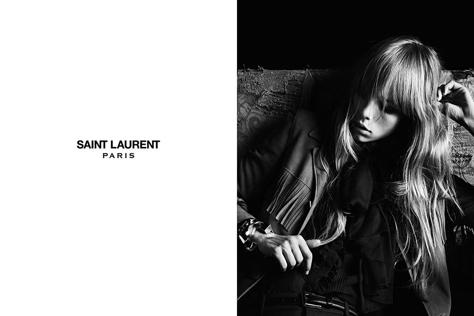
You might not know this but rebranding Celine wasn’t Hedi Slimane’s first dauntless move as creative director. He did it first back in 2012 at Saint Laurent when he turned ‘Yves Saint Laurent’ into ‘Saint Laurent Paris’ and replaced the iconic YSL logo. At the time, dropping ‘Yves’, which is the founder’s first name, sent so many fans of the brand into panic mode. Over time, people have gotten a little more accustomed to the idea of change and new direction in the fashion industry, and that’s how we think we’ll survive this renaissance.
By Sarah Guirguis


