By Hend Seif El Din
How many times have you heard of binging when stressed, devouring numerous chocolate bars to “feel happy,” exercising to try to cure insomnia, and taking a long hot bubble bath to–again– try to unwind? If you’ve answered “yes” to at least one of the above, then trust me…you’ll be happy to know that by making the right color choices in your home, you could avoid the pitfalls of our ever-changing mood swings.
When it comes to interior design and choosing the perfect color scheme, psychologists believe that your choices can determine your moods and ensure–or completely ruin–your chances at leading a relaxed, healthy, and happy life.
Bright colors, which include vibrant hues of yellow, orange, blue, and green, ensure expansive feelings. These colors are happy and friendly, encouraging healthy communication. Consider using these shades in the dining area, as well as in the kitchen.
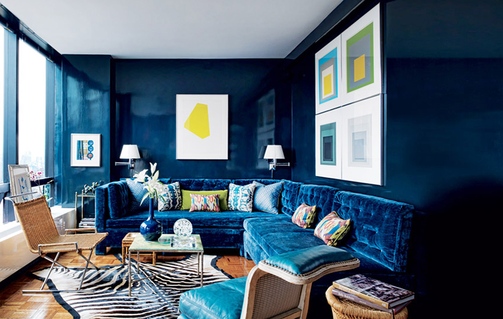
Dark colors, namely darker shades of purple, blue, green, and red could have a gloomy and limiting effect. Nevertheless, when used in the right way, they can provide a cozy ambience. If you’re not so sure about making the right decision when it comes to dark colors, why not opt for furniture accents instead?
Warm colors, such as orange and yellow, are proven to “raise” the temperature of the room, with regards to perception, of course. So if there is a specific room in your house, which tends to be “cooler” than others, why not heat it up with a warm orange hue? Do avoid these colors, which inspire activity, in areas meant for relaxation and unwinding, such as the bedroom.
Cold colors, including icier shades of green and blue, which have a great calming effect, making them suitable for bedrooms. These shades will help you go to bed relaxed and will ensure that you wake up feeling refreshed in the morning.
Now that the basic groups are covered, there still are some specific colors that need your attention.
Red, which is strongly linked to the physical, raises energy levels in a room, and can thus lead to irritability and strain, if not used cautiously. Again, to stay safe, consider adding a few red accessories as opposed to option for a red wall.
If you do, however, still feel like going completely red, keep in mind that the saturated, vibrant hues of this color have been linked to an increase in heart rate and blood pressure. In other words, go for warmer shades of red such as venetian red, brick red, and red ochre, which will promote coziness and warmth.
Navy blue, unlike its “sister hues,” is an inhibitor, decreasing people’s willingness to communicate, so avoid using it in your living area and/or your dining room. After all, I’m sure you wouldn’t enjoy total silence!

Green is the color of lovely Mother Nature, representing harmony and serenity. This healing and soothing hue has been proven to help hyperactivity in children and is believed to create a feeling of calmness. Try mixing it up with complementing colors or a plethora of shades.
Purple…the color of greatness! This positive color is also known as the “inspirational” and/or “spiritual” color, connecting the body, mind, and spirit. If you happen to have a preferred meditation area, purple is definitely the color to go for! Piece of advice: I suggest opting for the more bluish hues as opposed to ones with red undertones.
Pink. Let me guess, the words “cotton candy” popped into your head, but that’s not what I mean. To avoid creating an über-girly space, consider using a powerful shade like fuchsia, which suggests glamour and energy. For a soft, soothing feeling, opt for blush. Consider combining these shades with sharp lines and sophisticated fabric to steer clear of ending up with an overly-romantic space.
Brown hues suggest relaxation, since–along with green–they represent nature. This color will definitely make a room feel inviting, cozy, and warm. Consider combining light and dark shades and/or opting for various textures and materials. Since this hue comes in a plethora of very “practical” shades, you can use it to either highlight stronger colors or tone down a space.
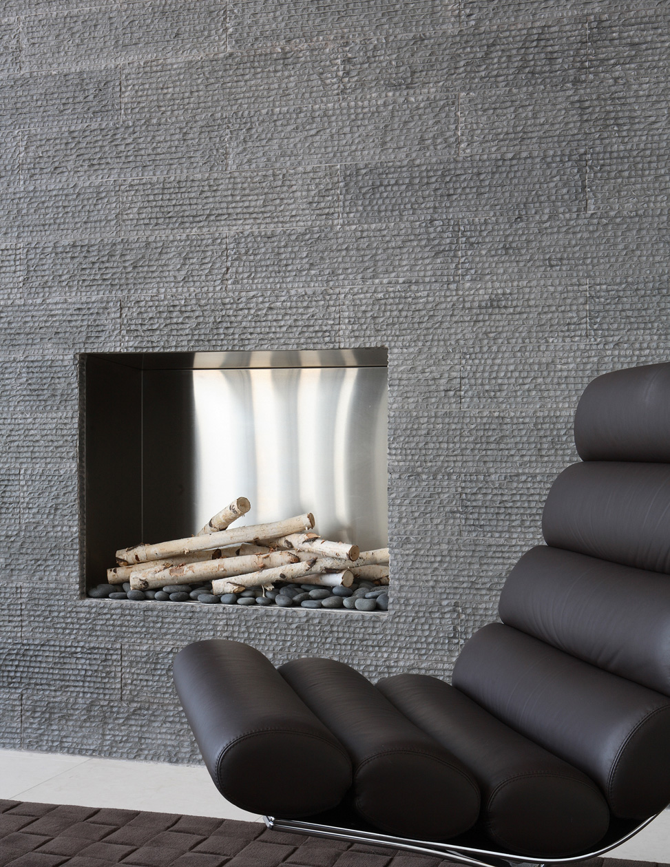
Gray resonates with serenity. The colors itself has an innate sophistication and calmness. Again, this is a very versatile choice, since you can manipulate it as much as your heart desires! Want to warm up a room? Go for a gray with beige undertones; are you looking for a cooler option? Go for a shade with bluish undertones. Mixing shades–again–ensures a feeling of simplistic glamour.


